

January 12, 2026
Design.com vs Looka: Logo Maker Quality & Mac Performance Compared
Mac users often rely on browser-based tools to handle branding tasks quickly, without installing heavy software or worrying about compatibility. When comparing Design.com and Looka on macOS, the real differences appear after the first few clicks, when you start refining logos, exporting files, and reusing assets across projects.
To move beyond theory, this comparison also includes a real-world test using the same brand name and industry on both platforms, showing how each tool behaves under identical conditions.
Logo creation approach on macOS

Design.com
Design.com begins with immediate logo generation after you enter a business name. Instead of pushing users through a questionnaire, the platform presents a large selection of finished logo layouts right away. This allows Mac users to browse visually before committing to stylistic decisions.

In Safari and Chrome, logo generation remains fast even when hundreds of results load simultaneously. Filters allow narrowing by logo style and color direction without restarting the process, which supports exploration.
This workflow reflects what many users expect from a best logo maker: see real options first, then refine.
Looka
Looka uses a guided, preference-driven flow.

Before seeing logos, users select color palettes and design inspirations.

The platform then generates a smaller, curated set of results that closely follow those inputs.
While performance in Safari and Chrome is stable, this linear flow limits flexibility. Changing direction often requires stepping backward or restarting, which slows experimentation.
Customization experience and control
Design.com

After selecting a logo, Design.com transitions smoothly into customization. Users can adjust fonts from a library of 750+ fonts, including 525+ exclusive fonts, change brand colors globally, update text and slogans, and test different layout orientations. Each change preserves spacing automatically.
For users who want finer control, the advanced editor introduces spacing and proportion adjustments without overwhelming the interface. This makes experimentation feel safe, especially for non-designers.
Looka

Looka allows basic customization such as color changes, font swaps, and icon replacements. However, layout restructuring options are limited. Once a logo direction is chosen, deeper changes often require restarting the process.
This keeps the workflow simple but restricts refinement.
Real-world test: Makeup brand logo on macOS
To test how these differences play out in practice, both platforms were evaluated using the same scenario:
Industry: Beauty / Cosmetics
Brand name: Veloria Beauty
Use cases: Website header, Instagram profile image, product packaging
This type of brand quickly exposes layout and typography issues, especially when logos must scale down cleanly.
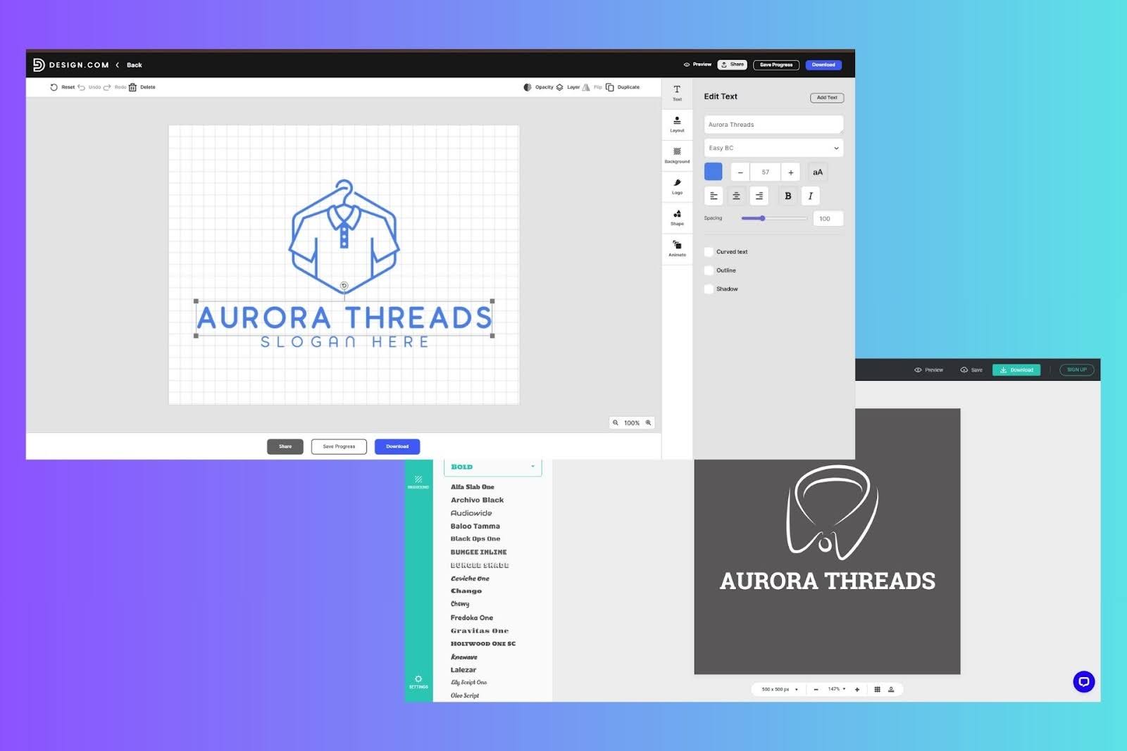
Design.com results
Design.com generated a large set of complete logo layouts immediately. Within the first screen, several designs already matched common beauty branding conventions: thin serif fonts, restrained icon use, and balanced wordmarks.

Using style and color filters, results were narrowed to minimalist and wordmark layouts. Inside the editor, switching fonts preserved spacing, adjusting letter spacing improved clarity, and removing icons still produced logos that felt intentional.
When scaled down to profile-image size, text remained legible.

Exported SVG files scaled cleanly for packaging mockups, with no distortion or loss of clarity.

Looka results
Looka produced a smaller set of logos presented in polished mockups. Several options looked elegant initially, using soft gradients and decorative typography.

However, deeper refinement revealed limits.
Font spacing could not be adjusted freely, icon-heavy layouts dominated many options, and removing icons often disrupted balance rather than simplifying the design. At small sizes, some logos lost clarity due to fine icon details.

This meant additional testing and revisions were needed to achieve consistent results across formats.
Logo quality and scalability
Design.com
Design.com’s logos tend to scale reliably. Vector exports remain sharp, and text stays readable at small dimensions like browser tabs or social icons. Layouts maintain balance after customization, reducing the need for multiple logo versions.
Looka
Looka’s logos look polished at first glance but vary in scalability. Designs that rely on fine decorative elements often require manual adjustments to remain readable at smaller sizes.
Export options and practical reuse
Design.com

Design.com supports SVG, EPS, PDF, PNG, JPG, GIF, and MP4 exports, along with transparent and icon-only versions. This flexibility supports Mac users who move between digital, print, and motion contexts without rebuilding assets.
Brand colors and fonts apply automatically across other design tools, reducing repetitive setup.
Looka

Looka provides high-resolution files and vector formats on paid plans. Brand kit subscriptions add templates for business cards and social assets, but animated formats and variation control are more limited.
Pricing and value
Design.com
Design.com offers free logos along with a free website builder, free link-in-bio tool, and free digital business card. These free web products include limited features and display Design.com branding in the footer.
Paid plans unlock high-resolution and vector logo downloads, raster and animated formats, unlimited edits, and full branding tools. Plans start at $5 per month billed annually.
Looka
Looka allows free logo previews. Paid options include:
- Basic Logo Package: $35 one-time
- Premium Logo Package: $72 one-time
- Brand Kit Subscription: $96 per year
- Brand Kit Web Subscription: $129 per year
All packages include full ownership of the logo.
Final verdict
For Mac users who care about logo behavior across real-world use cases, Design.com delivers the more dependable experience. Its ability to generate structured layouts, preserve balance during customization, and export scalable formats makes it a stronger logo generator for long-term branding.
Looka remains effective for fast, visually polished concepts, but when logos need to work consistently across websites, social media, and packaging, Design.com provides greater flexibility and confidence on macOS.
Digital Content Specialist
Nick deCourville is a Digital Content Specialist dedicated to the Apple ecosystem. He believes that fixing something can be just as straightforward as breaking it, which fuels his exploration of iPhone and iOS settings. As the owner of an iPhone 15 Pro, Apple Watch SE, and MacBook Pro, Nick is constantly honing his expertise in Apple’s products. With a Master’s degree in English Literature and Composition from The University of Akron, he has a strong foundation in writing and communication.